
Guest Post: Sharks Time Capsule #1
By Megalodon
In 2001, the San Jose Sharks' AHL affiliate, the Kentucky Thoroughblades (worst name EVER!) were moved to Cleveland, Ohio. Once there, the team name was changed to the Cleveland Barons, to reflect the now-defunct AHL team that had existed in the city from 1937-1973.
The old Cleveland Barons logo looked like this: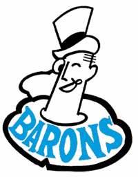
Hey look! It was already Sharks colors, pretty much. Convenient, right? But obviously the logo was a little out-dated, and needed a redesign. The question was, what new image could incorporate elements of the Sharks brand while still retaining the class and charm of the traditional logo? Would they use San Jose's color scheme more extensively, or perhaps go subtler, changing the font or adding a hint of a Shark fin somewhere to the Baron's outfit?
BOOM: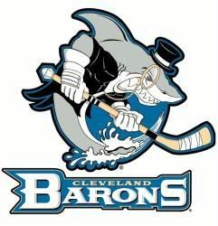
Take that, subtlety! Is that a Shark AND a Baron? Damn straight it is. Problem solved - we've got our new logo! Not only will this guy eat you alive, but he won't even lose his monocle while he does it. Then he'll tip his hat to your shredded corpse before swimming off to attend regattas and grand cotillions. (Ed. note: First use of "cotillion" in a post about hockey ever? I sure hope so.)
According to Wikipedia, the Shark in the Barons logo was originally designed as a possible alternate logo for San Jose (yeah, right) and then they just stuck some baron clothes on it with photoshop or something. Sweet. Good work, guys.
I wish all NHL teams would do stuff like this with their affiliates; these bastard hybrid logos would be some of the greatest ever. The Portland Duck-Pirates? The Norfolk Lightning-Admirals*? The Bridgeport Islander-Sound Tigers? (Wait, did I do that right? What the hell is a sound tiger?)
Sadly, the Barons moved to Worcester in 2006, and became simply the Worcester Sharks, who apparently are still using the Sharks' old logo and jersey design. So I guess the Baron-Shark hybrid is gone forever...but I can still have high hopes for the Chicago Thrasher-Wolves!
* - Wait, the AHL has two teams named the Admirals - Norfolk AND Milwaukee? Lame.
"Who are we? The Wildcats! Who are we going to beat? The Wildcats!"
![]()
![]()


5 comments:
*Tumbleweed blows by
I still support your interludes, Megalo!
I think my writing is too controversial for people to handle. I'm like the Marquis de Sade of discussing minor league hockey logos.
A Thrasher-Wolf would be terrifying. They should definitely go to that.
Duck-Pirates, on the other hand, make me think of Donald, Daisy, and the whole clan, except with eyepatches.
Don't look now, but the Barons shark has been resurrected in Beijing as the logo for the China Sharks...minus the snappy threads, of course.
Post a Comment