Takes and trash talk from both ALL sides of the NHL's most obscure PATHETIC* rivalry

* Thanks, Kevin Lowe!

Showing posts with label Logos. Show all posts

Sunday, November 30, 2008

Earl Takes a Request

Tim Sassone, Chicago Beat Writer, November 25:

Is it being a little too greedy to think the Hawks can go 6-0 on this road trip? Wednesday's game in San Jose won't be easy, but the Sharks can be beat and the Hawks almost did it last week at the United Center. The Hawks led 5-4 going to the third period then took a couple dumb penalties and wound up losing 6-5. It's on to Anaheim Friday and the Ducks aren't anywhere near as good as they were when they won the Stanley Cup. The Hawks close the trip Saturday at Los Angeles against an improved, but nothing special Kings team.
Rudy Kelly, BoC Blogger, November 29:
The Blackhawks have lost both California games (against San Jose and Anaheim) this weekend. Let's make it one more so Earl has to bust out the ol' rape graphic again.
Well, apologies for the absence this week, but with siblings in town for Turkey Day, I was away from the computer for a bit -- but I've had myself a great week. I was even in Row B for Friday's game against the Blackhawks, and had great seats to see Wild Wing trip over some carpeting thanks to his duckbill-obstructed view. It was a pretty fun afternoon and a decent 1-0 game, and it's not hard to see why Blackhawks fans are excited this year -- this looks like a top-eight roster and once a goalie gets moved there's even salary room for improvement. Still, I'm not sure they're ready to call for sweeps just yet on the west coast swing; those are rare even for the great teams since the lockout (see comment #2 in this post), and there's always plenty of legit excuses -- miles, time zones, often back-to-backs, home refereeing, and the fact that SJ is killing all visitors this year. Whatever, the dude called the BoC road trip out and crapped out hard, and will get what he deserves.

San Jose Sharks 3, Chicago Blackhawks 2 (OT)
Anaheim Ducks 1, Chicago Blackhawks 0
Los Angeles Kings 5, Chicago Blackhawks 2
Battle of California 9, Sweep-Talking Blackhawks 4


Modified from the State Rape cartoon that started it all.

Go Ducks (and sure, Kings and Sharks too when it makes for a good graphic).

Tuesday, August 19, 2008

Eep

James "The Commissioner" Gordon of the Ottawa Citizen managed to muckrake a few possible alternate logos for the upcoming season. Among them is the alternate logo for the Los Angeles Kings.

Eep.

That's going to be on the front of the jersey? Yikes. It's basically a giant arrow pointing down at their dicks. That would look good on the shoulder of the jerseys, but on the front it would look like hell. Gordon points out that it's possible this isn't actually the logo (companies will register logos that they might possibly use but then never end up using it), but for now consider me unimpressed.

(H/T Puck Daddy)


Update: Connie is similarly unnerved.

Monday, July 28, 2008

LA Third Jersey News

New information is leaking about the Kings' new jersey for the upcoming season, thanks to Howard Berger of HockeyBuzz. Here's his description of what the jersey will look like:


LOS ANGELES: The Kings will unveil a predominantly black jersey with the letters “L A” inside a pencil-point logo on the front. Broad white stripes will adorn each arm. A thin white stripe will run horizontally on each side of the jersey, just beneath the shoulder. There are no stripes at the bottom of the uniform. The color purple – widely evident in the Kings’ primary jersey – will likely be featured in the number outlines of the alternate, though the photo copy I have doesn’t clearly show it. A better idea would have been a reprise of the Kings’ original purple and gold uniforms from 1967, but the club marketers are apparently not bent on tradition.


Now, can someone tell me what a "pencil-point logo" is? I have no idea. Also, I'm a little worried it'll look like a roller hockey jersey, what with the broad white stripes down the arms and nothing at the bottom of the jersey and all that. One bonus? No purple. I don't know about you, but I hate the purple addition to the black and white. Why purple and not gold? It bothers the shit out of me.

This jersey sounds like it'll be a compromise between the Kings' current jerseys and their Chevy logo days from the '90s. I'm all for any jersey that reps LA, so I'll give this jersey a tentative thumbs up for now.

Update:
Reader Andrew points out that the description reminds one of the Galaxy logo:

Wednesday, July 09, 2008

Sleek gets ImMirtle-ized. Go Pigs!


That'll do, pig. That'll do.

So I was mostly without internet today, and didn't see this until late. Apparently the Ducks' AHL affiliate, now in Iowa, came out with this new name and logo. And it wasn't until I read this post that I realized that as a Ducks fan, I guess I'm supposed to be outraged.

Ummmm, sorry, but I really can't care one bit. In fact, I'm mystified that this bothers Ducks fans at all.
  • As far as I'm concerned, Des Moines is no closer to SoCal than Portland (ME) was. So long as it's not accessible by television, it's completely off my radar. I've only seen one AHL game in my life -- during the lockout they televised the AHL All-Star Game. This is a logo I'll probably never see.


  • As for the logo itself, what's there to get upset about? Didn't we Anaheim fans spend a decade rooting on a cartoon farm animal? Hey, I'm a guy who firmly believes that all team names and all logos are inherently stupid, and anybody who is going to stand up for a Red Wing or a Maple Leaf and ridicule a Duck or a Pig needs to argue with somebody younger than me. I do prefer having a logo to not having one, though; two years later I'm still sort of miffed that the Ducks chickened out and went with a non-offensive "text only" design.


  • Besides, there's plenty of ways that I can draw a pig. And that's exactly what king of bloggers James Mirtle jokingly challenged me to do. He started this blog, so I felt obligated, and I'm kind of happy with how it turned out -- click here to see it.
Go Pigs.

Thursday, April 10, 2008

Ducks Gameday—Stars Logo: Separated at Birth?

Round One, Game One: (5) Dallas Stars at (4) Anaheim Ducks
(JavaGeek 'odds': DAL 53%)

Ah, good ol' Game 83, time to break out some playoff traditions. Last year I started a gimmick each series where I played "Separated at Birth?" comparisons with opponent team logos. It wasn't by any means a very serious exercise, but it worked out well enough to give it another go this year.

Here is last year's set: the Minnesota Wild, the Vancouver Canucks, the Detroit Red Wings, and the Ottawa Senators. So take a glance below; which image is most "Separated at Birth" from the Stars logo? Vote for your favorite in the comments, or feel free to suggest your own.


Image results from my 'Star' search... (sigh).


Last night was an interesting Day One of the playoffs. In 3 of the 4 games played, a team quickly lost home ice advantage, which is a bit frightening. I made a late-night PuckToon about it over at Fanhouse (a feature I plan on resuming now that I'm attached to a scanner again; also on a side note, starting next week I'm writing their Ice Sheet each Wednesday).

To tell the truth, I'm not that stressed about game one, but that's because I'll be tracking tonight's game on my cell phone. I'm caught in a prior engagement and can't watch the game live, but it's not the worst thing; generally it's less stressful to scoreboard-watch than it is to yell at the TV for three hours. By the time I do watch the game late-night on my DVR, I'll already know the outcome, so feel free to comment on any game observations—you won't be spoiling anything. [EDIT: Spade's got some good Turco strategies on his new blog, complete with diagrams!]

I do have tickets for game 2, though. More on that later.

One player to watch for tonight will be J.S. Giguere, just to see whether he actually plays. Two years now I've been fooled into thinking Giguere would start the playoffs, only to be surprised by Bryzgalov at gametime; would they dare trick me a third year in a row?

Prediction: Ducks 3, Stars 2. Goals by Selanne, Pahlsson, and Schneider. And so it begins.

Go Ducks.

Sunday, April 06, 2008

Ducks Gameday—Updated Logo

Phoenix Coyotes (38-37-6, 12th in west) at Anaheim Ducks (46-27-8, 3rd in west)

Memo to the league: Pronger's back, so watch your head (and shins)! In fact, I've gone ahead and updated my re-designed Ducks logo to help remind opponents of the constant danger they are in:


Note: Ducking might not prevent getting stomped on.

Prediction: Ducks 3, Coyotes 2, in the last meaningless game of the year. Goals by the thugs: Pronger, Mayday, and Bertuzzi.

Go Ducks.

Sunday, February 24, 2008

Ducks Gameday--An important day in avian justice

Chicago Blackhawks (29-26-6, 13th in west) at Anaheim Ducks (35-23-7, 3rd in west)


Well, as part of leaving my old job I have rescinded my laptop, so for the next week or so I'll be managing on my roommate's computer. No spreadsheet stats, no power point, but it's still got good ol' MS Paint!

It may be the case, though, that I'm less restricted by my roommate's software than I am by the motivation of being unemployed for a week. This could be a very lazy week indeed.

Prediction: Hmmmm. Ducks win their avian lawsuit 5-3. Goals by Perry x2, Moen, Pahlsson, and Sutherby.

Go Ducks.

Wednesday, October 03, 2007

Ducks Gameday—Wait, we gotta open the North American season too?!

Anaheim Ducks (1-1-0, t-1st in west) at Detroit Red Wings (0-0-0, t-3rd in west)

So, after starting the year in London, the Ducks now move on to a stretch of four straight home openers (including their own), all within the next week. They'll open Joe Louis Arena tonight, Nationwide Arena on Friday, Mellon Arena on Saturday, and Honda Center a week from now. I made the table below to demonstrate this (distances calculated using this site). For the first six games, the Ducks will travel an average of 1,945 miles per game.

Date

OpponentLocationDistance Traveled

Sep. 29-30

Kings

London, ENG

5,454 miles

Oct. 3

Red Wings

Detroit, MI

3,762 miles

Oct. 5

Blue Jackets

Columbus, OH

165 miles

Oct. 6

Penguins

Pittsburgh, PA

162 miles

Oct. 10

Bruins

Anaheim, CA

2,124 miles

12 days6 games5 cities

11,667 miles


I'm not whining about it, necessarily, but I'm not getting my hopes up too much either. Last year, the Ducks had only 3 regulation losses in their first 34 games; this year they'll have to work their tailfeathers off to avoid having 3 in their first 6.

As for tonight, why not get this gauntlet started with good old Detroit? The Ducks franchise has made the playoffs five times, and four of those times they've met up with the Red Wings. They're as drawn together as the this blog is to lame humor. Speaking of which, here's one of my favorite graphics from this last spring's series:


Nice smash, Mario!

If my pal Damndaze is any indication, Red Wings fans hate the Ducks a ton--but I'm still unsure where the rivalry ranks among the Avs, Stars, and the rest. They hate J.S. Giguere for sweeping them in 2003. They hate Chris Pronger for eliminating them in 2006 and elbowing them in 2007. They hate Scott Niedermayer for his fluke goal off Lidstrom's stick to tie the game late in regulation of G5. They hate Teemu Selanne for finding a puck alone with Hasek in G5 overtime and roofing a backhand over the squirrely Czech. And they really hate that G5 was arguably the one game that decided the Cup. Even after that, they hate that the Ducks nabbed Schneider and Bertuzzi, who Damndaze at least thought were going to sign homer deals with Ken Holland.

So count on a motivated Wings crowd tonight--one that might like to demonstrate how a G5 might have gone without a Scott Niedermayer and without a Teemu Selanne. Also, this time they can enjoy the fact that Mathieu Schneider's injury tests the Ducks' depth instead of the Wings'.

Aw, but here's one semi-encouraging stat for the Ducks: in 10 games against the Ducks (regular season and playoffs), the Red Wings scored 12 power play goals. Scott Niedermayer was on the ice for 11 of those. Chris Pronger was on the ice for zero; the last power play goal the Red Wings have scored with Pronger on the ice was scored on Dwayne Roloson.

Also worth noting: in 10 games against Detroit, Dustin Penner had 0 goals and 0 assists. That seems replaceable enough.

Prediction: Ducks 3, Red Wings 2. Goals by the three Ryans: Getzlaf, Carter, and Bobby. I don't even really know who the Ducks will be playing in net, but with 3 games in 4 nights, it's probably a good thing that Bryzgalov, Hiller, and Giguere are all possibilities.

Go Ducks.

Thursday, September 13, 2007

Guest Post: Orange Rhymes With Sucks

My roommate, who goes by Megalodon (oddly enough, that's not a nom de plume; that's his real name), is a Sharks fan. Like all Sharks fans, he's smart, socially awkward, and very, very smug. He's been worried about the Sharks' new jerseys lately, and since I'm sure you're tired of reading my 8,000 word screeds about the Kings' 3rd liners, I told him to write something up. Here's what he came up with:


As a loyal Sharks fan in exile deep in DucKing territory, the image of my home team is very important to me. I have many fond memories of riding the train from my home town in the Bay Area to the arena for a game. Amidst the normal assortment of train riders – college students, drunks, and guys who just got out of prison for robbing a bank and don’t want to buy a knife from another guy on the train (long story) – were a few good souls proudly displaying their chosen uniform - teal. Since the Sharks let go of their original jerseys (which, no debate, sucked ass), they’ve had an edgy, stylish look that has served them well. Every game in San Jose the arena is a sea of cool (in temperature and in awesomeness) colors: teal, silver, and black. They had an identity and a color-scheme that stood out in the league, and I loved it.

I’m not here to complain about the new logo. It’s fine. It’s a mean Shark biting a stick, so they kept the spirit of the original. What does concern me, however, are all the rumors that have been going around about the new jerseys making a much bigger deal of something that’s thankfully been a minor part of Sharks history thus far – orange. The Sharks have always had a touch of orange in their logo, and the updated version emphasized it a little bit, which was fine. It’s never been on their jerseys before, and so orange and me got along fine. I was ready to dismiss the rumors about the new orange jersey until I saw pictures of the Sharks players at last weekend’s pacific division tournament:


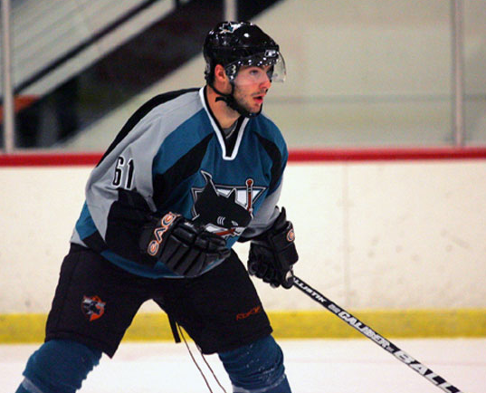
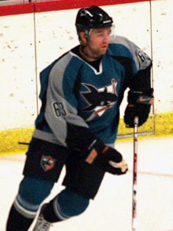
They’re wearing the old uniforms, but the pants and gloves they’ll use this season. Do you see what I see? Did your heart just sink out of your ass? Yeah, me too. There’s an awful lot of ORANGE on those accessories. So much orange that it would look quite strange if there wasn’t a good amount of it on the new jerseys.

I am anxious. I am nauseous. I am filled with fear and loathing.

Color-wise, the team will still stand out from the pack - just like the dude at the party with the lampshade on his head. If I do something drastic Monday when the team unveils the new jerseys, let this be a record of what drove me to it – the cursed color orange.

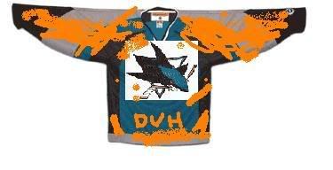
Bonus artist's conception of the new jerseys here!

Wednesday, August 22, 2007

Is it time for the Ducks to get a logo?

I must admit, I was pretty inspired by Pfizer's mother-of-all-Canucks-logos (happy birthday, Alanah!); it really got me to thinking--shouldn't the Ducks get back to the logo game? If you recall, last summer the Ducks introduced their new look uniforms, featuring a webbed-foot text which was at least successful in reminding absolutely nobody of Disney, but still it lacked a true logo. Instead of a picture of an actual duck, we instead were treated with forensic evidence that suggests that duck-like creatures may have once inhabited the earth.

Anyway, now that the team has divorced itself from the Disney movie, I can't really say what association the team or the city of Anaheim has with actual ducks. But with the right logo, maybe we could re-associate the team name with the actual identity of the team--we could stop pretending that “Duck” refers to some animal, and instead acknowledge that it better reflects an appropriate action to take when May, Bertuzzi, or Pronger is skating up to you.

So here's my proposed Anaheim logo for '07-'08. Enjoy!:

If anyone has a cleaner Bertuzzi shot, send it to me and I'll gladly work it in.

------------------------------------


I've been spending a lot of time this summer commenting at Interchangeable Parts--I'm not sure how best to describe it, except the commenters there are hilarious; it's really a blog to hang out at. Pookie and Schnookie have been diligently running a summer series "118 reasons why we love hockey", where they celebrate different aspects of today's NHL (or hockey in general). Anyway, I got to write one as a reader submission, so if you're interested you can see one reason why I love hockey, though if you cruise the archives you'll see that they've got a lot of better-written posts than mine.

Tuesday, July 24, 2007

BoC stumbles across a new banner

Boy, sometimes this blogging gig is really too easy, I gotta say. First off, a heavy thanks to Steve at Battle of New York, who sent me an e-mail two weeks ago bragging about his new logo guy Dustin. Of course, being the graphics snob and techno-idiot that I am (how do you install a banner?), I ignored it.

Until today, when Dustin (whom I've never corresponded or collaborated with before) e-mails me with this already-completed logo/banner design:

Seeing as I never replied to Steve's e-mail, I was taken aback by this: a Devils fan, unsolicited, has decided to bestow upon this blog a kick-ass set of theme graphics? Will the wonders of the internet never cease?

Anyways, I spent a little bit of time today pushing components around the site, so feel free to critique the new look in the comments. And yeah, Sharks fans (and your aggressive googling). I know you guys just got yourselves a new logo that hasn't been incorporated [WEDNESDAY MORNING EDIT: Now it has! Thanks again, Dustin!]. But c'mon, it was free cheap! Well, so long as we promote our first-day-hired logo man, though:
In addition, I took a first sweep at managing our sidebar links; quite frankly, the list was pretty long and unhelpful. This organization is still in progress, but so far I separated out the links for the California teams (BoC supports them enthusiastically, of course), and I also created a list for BoC Inspirations, which really represents blogs I read and commented on before I was a blogger myself. More work to do with the blog links this summer, though.

Oh, and for those of you who fancy me a graphician, don't think the notion of a blog banner hadn't occurred to me before. Below is the prototype I had been working through the middle of last season, but ultimately procrastination ruled the day. These days, though, I'm feeling kind of lucky I didn't spend more time on this project; just for fun, can you count the number of players that would have needed to be replaced by now?
Anyways, thanks Steve, Dustin, and the wonder that is the internet! If anyone else wants to submit an unsolicited graphic this summer, so far I think we've shown a great willingness to publish!

Thursday, July 12, 2007

The new Sharks logo (maybe)

Several message boards (and our pal Steve at Battle of New York) have posted what is supposedly the Sharks new logo. Drum roll, please...
IF (and that's a big if) this is the Sharks new logo, then it'll be as reported "updated, sleeker, more 3D".

My question to all of this is why? To me, it just looks like someone viewed the original Sharks logo through the lens of Batman: The Animated Series. That's not necessarily a BAD thing, but it all seems rather unnecessary.

I, for one, am not a fan of cartoony logos (Sleek, do you own the infamous Duck Breaking Through Ice jersey?). Original Senators crest? Cool. Creepy looking Senator dude staring at me? Not so cool. NY Islanders crest? Cool. Creepy fisherman guy? Very not cool. Nashville's main logo? Not great, but definitely not bad. Weird 3D alternate version? Looks like a fanboy had too much fun with a 3D modeling program.

Since the Sharks always bitch and moan about losing money (I'd like to see if they actually count suite sales in their records since companies have to buy them for EVERY event, check payable to Silicon Valley Sports & Entertainment), forcing an entire fanbase to buy a new logo can do wonders for sales. Did this logo really need revamping or was this just a nice opportunity to cash in on the new Reebok jersey changeover? You make the call!

One thing's for sure...if and when I get one, I will avoid putting any names on there to prevent any further jersey curses.

Monday, May 28, 2007

Ducks Gameday—Sens Logo: Separated at Birth?

Round Four, Game One: (4) Ottawa Senators at (2) Anaheim Ducks
(JavaGeek 'odds': ANA 52%)

So, I've been running this feature for all opponents these playoffs, and it seems to be working well enough to continue once more. Just like the Minnesota Wild, the Vancouver Canucks, and the Detroit Red Wings before them, I've found three candidates to be 'separated at birth' with the Senator logo. Vote for the best match in the comments, or offer your own suggestions, if you wish.


As for the game, well, I don't know what to say any more. There's enough professional sportswriters covering this series now that I don't have very much original to add at this point.

Really, the only key is winning early. Ottawa's never trailed yet in a series, and in these playoffs the first team to face elimination in each series has lost each series. Taking advantage of early home ice will be key--whether the wins come pretty or ugly, the main thing is they really gotta come early.

At any rate, I'll be at this game, not visible to the TV cameras, but in Section 201, Row N, green t-shirt. Feel free to stop by, buy me a beer, or just congratulate me for not selling my tickets for something in the four-digit range.

Prediction: Ducks 4, Senators 2. Goals by Penner, Pronger, Pahlsson, and (pending a better nickname) Miller Lite.

p.s. I know a lot has been made about this being another case of a U.S.-team vs. Canadian-team SCF, but in the last 13 months or so Anaheim has now played playoff series against four different Canadian franchises--is that some sort of record?

Go Ducks.

Friday, May 11, 2007

Ducks Gameday—Wings logo: Separated at birth?

Round Three, Game One: (2) Anaheim Ducks at (1) Detroit Red Wings
(JavaGeek ‘odds’: DET 55%)

Now that we’re down to four teams, there’s literally dozens of writers covering the Ducks, so I’m not going to add too much today. I’ll get a much better feel for this series after watching G1.

In the meantime, I’ve been running this “Separated at birth” feature every series, so here goes: Which of these three candidates is the long lost twin of the ol' Winged Wheel?


You can vote in the comments, or recommend one of your own. (Previous ‘separated at births’: Minnesota and Vancouver)

Actually, I was so inspired by the Paratroopa that I went ahead and modified it a bit.


Nice smash, Mario!

Good sign for the Ducks: For the third series in a row, both Maggie the Monkey with her spinwheel and Forechecker with his spreadsheets are picking against the Ducks. I've got issues with both their methodologies, specifically as it pertains to biases against Anaheim, but I'm assured in the fact that they've each been wrong twice before. Maggie, in fact, picked against California every single chance she had this year--maybe a bad move, considering she's 6-2 in her other picks. Forechecker is 9-1 when not picking against the Ducks.

Prediction: Ducks 4, Red Wings 2. Goals by Selanne, Getzlaf, Pahlsson, and Marchant (empty-net). Amazingly, Brad May keeps up his astonishing streak of playing really good hockey only in the calendar month of May.

Go Ducks.

Sunday, April 29, 2007

Ducks Gameday—Canucks logo: Separated at birth?

Round Two, Game Three: (2) Anaheim Ducks at (3) Vancouver Canucks
(series tied 1-1, JavaGeek ‘odds’: ANA 57%)

Sorry, I thought when I started this 'separated at birth' theme with the Wild’s logo, it could be a regular feature. But when a logo is so obviously an killer whale, I can only do so much. If you want, you can vote in the comments, or offer a better alternative.


The Yankee Canuck posted a nice Hannibal Smith reference for his G2 post, but I refuse to be out-A-Teamed in this seven game series, so:


"I pity the fool who, uh, quack quack jibber jabber!"

The Canucks wanted a better result in G2, and even though it took a game-and-a-half, they got it. Time for the Ducks to respond. Vancouver will certainly be a different playing environment than the kick-back Honda Center, but this is essentially the same Ducks team that earned road splits or better in Calgary, Colorado, Edmonton, and Minnesota. They have dealt with hostile road crowds before; let's hope it can happen again.

Prediction: Ducks 4, Canucks 2. Goals by Selanne x2, Pahlsson, and Pronger.

Go Ducks.

Wednesday, April 11, 2007

Ducks Gameday—Wild logo: Separated at birth?

Game One: (7) Minnesota Wild at (2) Anaheim Ducks

I've put some candidates together, but I can't quite decide. Which handsome fellow (or logo) below represents the Wild’s long lost twin?


Cast your vote in the comments!

Anyway, tonight will be the only game of the series I'll be attending; section 201, Row N. New seats to me, but as I understand it I’ll be directly behind the net that Giguere defends in the 1st and 3rd periods (possibly the 2nd OT as well).

There's really not much to preview; these teams played four games this season, none of which occurred in this calendar year and almost entirely played without Marian Gaborik or Niklas Backstrom, so in a lot of ways we’ll be seeing this Wild team for the first time.

As such, my keys to the game are fairly straightforward: J.S. Giguere has to be great, Sammy Pahlsson has to be awesome, and the less I notice Dipenta and Huskins, the better.

Jim Kelley on why Sammy deserves the Selke Trophy:
There are a lot of candidates, many of whom go unnoticed or don't get the hype from PR machines and writers who think that it's for a good all-around guy who didn't win one of the other majors, but we here at Sportsnet.ca keep an eye on guys who play great D at the forward ranks, win faceoffs on a regular basis and do the things for which this award was created and that's Pahlsson who is a shut-down kind of guy and one of the best faceoff men in the game.
Prediction: Ducks 4, Wild 2.

  • Minnesota sets a franchise record for goals in a postseason game against Anaheim, but still ends up with a loss.
  • I set a personal record for least beers at a postseason game against Minnesota, but still wake up with a hangover.
  • Goals by Teemu x2, Pahlsson, and Getzlaf.
Go Ducks.

Tuesday, November 21, 2006

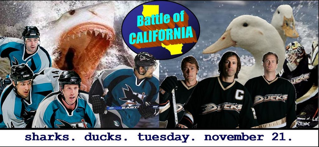
BoC Gameday—Sharks at Ducks

In response to this game-hype image, Sherry said…

Are those the most vicious pictures of ducks you could find? Poor things look like they're about to become supper.
Ah, yes. The old game of mascot vs. mascot. Well, in tonight's game, this 'shark vs. duck' figures to be a rather one-sided debate, it appears. A shark, the predatory terror of the open waters, vs. a duck, nature's bipedal version of Instant Noodles?

So what defense does a poor little duck have against a bloodthirsty shark?


Cough cough, go Ducks!!

Prediction: At some point, it will be Anaheim 2, San Jose 2. Beyond that, I should be pretty smashed.

p.s. Let me know in the comments if anyone else is going to the game. Maybe I’ll let you buy me a beer.

Tuesday, May 16, 2006

A Mighty finish?

Just a quick post about the name change.

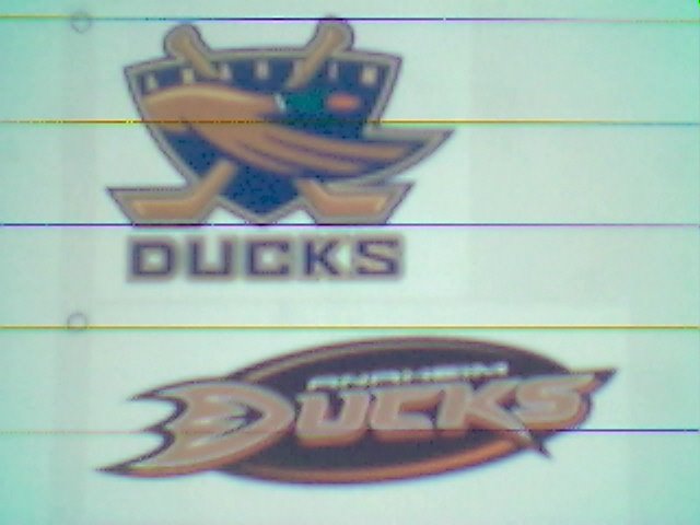
I am personally against it, for various reasons, most notably that really, all team names are stupid. However, if it must be changed, "Ducks" isn't so bad.

At any rate, I had found this picture of proposed logos on a message board a while ago (can't quite remember where); don't know if I'll get in trouble for posting it. Note that this probably came from a cell phone camera, thus the crummy quality.

Um... yay?

No word yet on whether a Cup win changes our plans.