
Guest Post: Orange Rhymes With Sucks
My roommate, who goes by Megalodon (oddly enough, that's not a nom de plume; that's his real name), is a Sharks fan. Like all Sharks fans, he's smart, socially awkward, and very, very smug. He's been worried about the Sharks' new jerseys lately, and since I'm sure you're tired of reading my 8,000 word screeds about the Kings' 3rd liners, I told him to write something up. Here's what he came up with:
As a loyal Sharks fan in exile deep in DucKing territory, the image of my home team is very important to me. I have many fond memories of riding the train from my home town in the Bay Area to the arena for a game. Amidst the normal assortment of train riders – college students, drunks, and guys who just got out of prison for robbing a bank and don’t want to buy a knife from another guy on the train (long story) – were a few good souls proudly displaying their chosen uniform - teal. Since the Sharks let go of their original jerseys (which, no debate, sucked ass), they’ve had an edgy, stylish look that has served them well. Every game in San Jose the arena is a sea of cool (in temperature and in awesomeness) colors: teal, silver, and black. They had an identity and a color-scheme that stood out in the league, and I loved it.
I’m not here to complain about the new logo. It’s fine. It’s a mean Shark biting a stick, so they kept the spirit of the original. What does concern me, however, are all the rumors that have been going around about the new jerseys making a much bigger deal of something that’s thankfully been a minor part of Sharks history thus far – orange. The Sharks have always had a touch of orange in their logo, and the updated version emphasized it a little bit, which was fine. It’s never been on their jerseys before, and so orange and me got along fine. I was ready to dismiss the rumors about the new orange jersey until I saw pictures of the Sharks players at last weekend’s pacific division tournament:
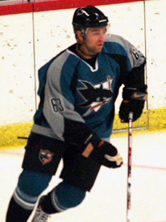
They’re wearing the old uniforms, but the pants and gloves they’ll use this season. Do you see what I see? Did your heart just sink out of your ass? Yeah, me too. There’s an awful lot of ORANGE on those accessories. So much orange that it would look quite strange if there wasn’t a good amount of it on the new jerseys.
I am anxious. I am nauseous. I am filled with fear and loathing.
Color-wise, the team will still stand out from the pack - just like the dude at the party with the lampshade on his head. If I do something drastic Monday when the team unveils the new jerseys, let this be a record of what drove me to it – the cursed color orange.
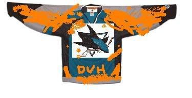
Bonus artist's conception of the new jerseys here!
![]()
![]()


8 comments:
Jerseys leaked from NHL08:
http://s44.photobucket.com/albums/f33/tjames06/?action=view¤t=sharksaway.jpg
http://s44.photobucket.com/albums/f33/tjames06/?action=view¤t=sharkshome.jpg
Not as much orange as I feared, but still a change. Overall I'm not horrified by them, which is saying something given most of the changes made around the league this year. It's a pretty traditional hockey look—a nice change from the Nike/Denver Broncos-inspired jerseys. I think they'll grow on me.
My roommate, who goes by Megalodon
What, was the name Nolan Owen already taken?
I embrace the orange. Not because it may have had some magical role in bringing the cup to Anaheim, but because I think it works well with the other colors.
The leaked jersey, however, I think is a step backwards. 80s era Edmonton Oilers shoulders? Traditional horizontal striping? Why?
Our organization didn't exist before the 90s. Why wear a jersey that looks like it belongs to a throwback era that we never belonged to?
I saw that jersey but I'm not quite convinced that it's the real one. EA will just make a jersey if they don't get the real ones in time (they did that with Atlanta when they first came into the league, I think). It's possible Reebok gave them the head's up, but I'm not sure.
Like before, the Sharks and Ducks will have simular jersey colours. I hate orange and I don't find it goes with teal but the new teal isn't like the old teal colour, so it might work. I hate the new logo and colours, in fact I hate most of the new logos and the Reebok design sucks esp when teams drop the bottom stripe to break up the oneness of the jersey.
I'm a die hard hockey fan but since the lockout the NHL isn't how it was and I don't like it. Each year seems to make it worse and worse.
I saw the leaked jerseys, and if they do turn out to be real, I won't be as nauseous as if they were heavily orange - but I will be VERY disappointed. You guys have already made good points about them, but my biggest complaint is that they are BORING BORING BORING. Plus they look a lot like the Thrashers' (and kind of like the Blues)jerseys also shown on that nhllogos site.
The orange is just sort of incongruous. Change for change's sake, not because of any deficit in the old colors (unlike the switch from the teal horror that were the original unis).
I'd put a small sum of money down that within 10 years the orange is gone.
This kind of reminds me of when this blog started. Mirtle picked an orange background (a la Battle of Alberta). Little did he or we know that within two years, 2 of the 3 BoC teams would go from little-to-no orange to quite the highlight.
That Mirtle. Always one step ahead.
Post a Comment