
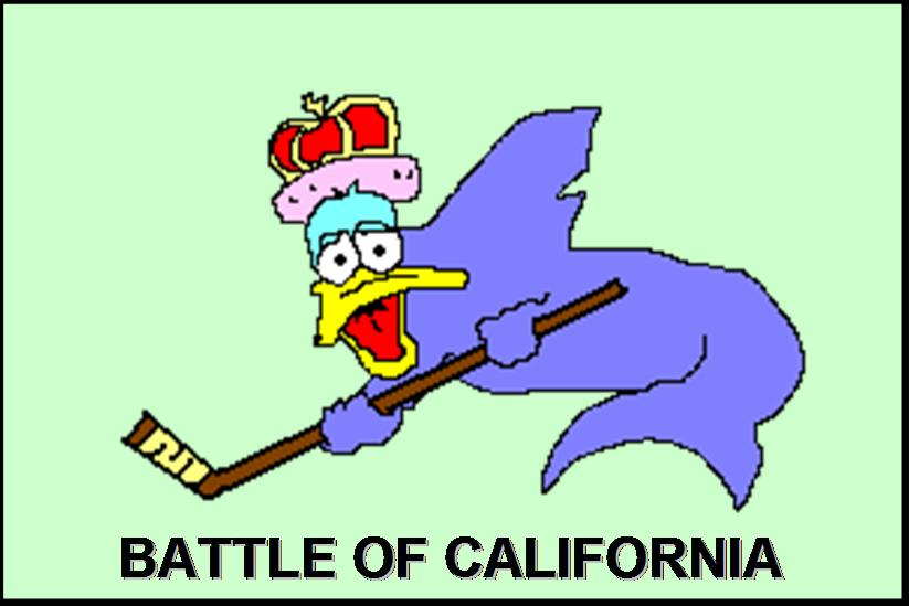
Eep
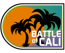
James "The Commissioner" Gordon of the Ottawa Citizen managed to muckrake a few possible alternate logos for the upcoming season. Among them is the alternate logo for the Los Angeles Kings.
Eep.
That's going to be on the front of the jersey? Yikes. It's basically a giant arrow pointing down at their dicks. That would look good on the shoulder of the jerseys, but on the front it would look like hell. Gordon points out that it's possible this isn't actually the logo (companies will register logos that they might possibly use but then never end up using it), but for now consider me unimpressed.
(H/T Puck Daddy)
Update: Connie is similarly unnerved.
![]()
![]()


3 comments:
Strangely, I think that logo would look pretty good if it said "Eep" instead of "LA".
I don't buy it. The white outlines are inconsistent in width around the black sections. My guess is shitty mock-up by a novice designer.
As a season ticket holder, I'll be getting this as part of my package.... I'll let you know...
Post a Comment