
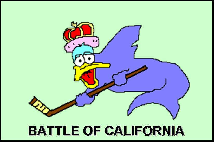
The new Sharks logo (maybe)
Several message boards (and our pal Steve at Battle of New York) have posted what is supposedly the Sharks new logo. Drum roll, please... IF (and that's a big if) this is the Sharks new logo, then it'll be as reported "updated, sleeker, more 3D".
My question to all of this is why? To me, it just looks like someone viewed the original Sharks logo through the lens of Batman: The Animated Series. That's not necessarily a BAD thing, but it all seems rather unnecessary.
I, for one, am not a fan of cartoony logos (Sleek, do you own the infamous Duck Breaking Through Ice jersey?). Original Senators crest? Cool. Creepy looking Senator dude staring at me? Not so cool. NY Islanders crest? Cool. Creepy fisherman guy? Very not cool. Nashville's main logo? Not great, but definitely not bad. Weird 3D alternate version? Looks like a fanboy had too much fun with a 3D modeling program.
Since the Sharks always bitch and moan about losing money (I'd like to see if they actually count suite sales in their records since companies have to buy them for EVERY event, check payable to Silicon Valley Sports & Entertainment), forcing an entire fanbase to buy a new logo can do wonders for sales. Did this logo really need revamping or was this just a nice opportunity to cash in on the new Reebok jersey changeover? You make the call!
One thing's for sure...if and when I get one, I will avoid putting any names on there to prevent any further jersey curses.
![]()
![]()


9 comments:
You know what, Chen? i really like this thing. That's not to say it's not a money grab in any sense, but if it works out as well as it did for the Ducks and Sabres last year (both on and off the ice), it's worth trying once, at least.
The NHL seems to have found a "trick" revenue stream in these jersey re-designs, but it worries me. I'm certainly not in favor of changing every couple of years, or whenever a franchise needs some spending cash.
For the record, I've bought exactly two new-logo t-shirts since the Ducks changed their look, and one was a gift. I'm not buying any sweater until the NHL and the team can convince me that it will have a shelf life of more than two seasons (let alone that a player might stay with the team that long).
I guess the bottom line: I don't like it when revenue and tradition go head-to-head, but at least this logo looks good by me.
I like it. Hey, you could buy a Thornton jersey, that's a pretty safe call isn't it?
Sure, unless there's further re-design on the Reebok fitted jerseys or the NHL decides to have home teams wear white.
There's still a fair amount of uncertainty that I'd hold onto my money for now (or only invest in t-shirts and the like).
If I bought a Thornton jersey, he'd probably be hit by a bus. I have that kind of luck with these things.
I can almost stomach it without the orange eye. WTF is up with that?
definitely has that "Scanner Darkly" look to it
I'm a huge Sharks fan. Have been for years. The logo did need a bit of revamping because, and take it from me being one, younger hockey fans need alot of change to keep satisfied with their team. Whether it be players, management, logo or even a city change. (Still waitin' on those Hamilton Preds).
That said, the rumour logo looks really... Unprofessional. I like the idea, you know, modernizing the old logo... But it simply doesn't work. I saw another leaked logo on another site, and it shows a full-body shark jumping in the air to snag a puck. The picture was black-and-white, so if it was legit, I'm scared the Sharks might ditch the Teal. (Which would really piss me off). I like that logo better, however... I'll link it if I can find it again.
http://boards.sjsharks.com/forums/index.php?act=Attach&type=post&id=107
^That's the link to it. Personally, I love that logo. *crosses fingers* They better keep the teal though, or somebody's losing a hand.
I know everyone thinks the cange to the logo really sucks because everyone was been a big fan of the old logo, but the more I see the new logo the more it grows on me. I actually thought it was really bad in the beginning but now it seems more fierce. I think that it is time for the sharks to get a new look with the changing NHL. Everyone thinks that the Sharks are totally changing because of their new logo and now they're sellouts and are more like the Ducks, but the same team that everyone has grown to love will still be on the ice. I think that they should make the border more strait and also straiten out the stick but other than that I think it's pretty awesome. This year we're definately going to win the cup because we continue to improve with our young talent. If you are a true Sharks fan you should embrace and accept the new look. GO SHARKS!
Post a Comment