BoC stumbles across a new banner
Boy, sometimes this blogging gig is really too easy, I gotta say. First off, a heavy thanks to Steve at Battle of New York, who sent me an e-mail two weeks ago bragging about his new logo guy Dustin. Of course, being the graphics snob and techno-idiot that I am (how do you install a banner?), I ignored it.
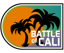
Until today, when Dustin (whom I've never corresponded or collaborated with before) e-mails me with this already-completed logo/banner design:

Anyways, I spent a little bit of time today pushing components around the site, so feel free to critique the new look in the comments. And yeah, Sharks fans (and your aggressive googling). I know you guys just got yourselves a new logo that hasn't been incorporated [WEDNESDAY MORNING EDIT: Now it has! Thanks again, Dustin!]. But c'mon, it was

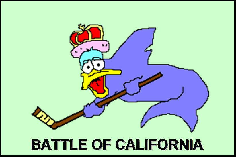
Oh, and for those of you who fancy me a graphician, don't think the notion of a blog banner hadn't occurred to me before. Below is the prototype I had been working through the middle of last season, but ultimately procrastination ruled the day. These days, though, I'm feeling kind of lucky I didn't spend more time on this project; just for fun, can you count the number of players that would have needed to be replaced by now?


13 comments:
Dustin did an amazing job. The California and New York banners are better than any of the new nhl.com webpages. Does his company have a website?
Will post more about the logo tomorrow.
Does his company have a website?
Oh yeah, I should have cleared this up in the post--he doesn't have a website yet, so far just the middle logo.
But you can shoot me a note if you want his e-mail address.
Hey Earl. Nice banner. You could try to "center" the banner. use the tags (center)* and (/center)* after the image.
*( = < and ) = >
Awesome new look.
So you guys get a new banner, the Stanley Cup and Lindsay Lohan driving your streets... sounds like an almost-fair trade off.
Bergman made me touch the code!
Haha, but it worked!
Huh, Norstrom and Conroy are on there. Wait, don't change it... I like looking at it.
Nice logo, eh?
It's very...Californian? Is that a word? :-)
You know, you could've just replied to the E-Mail! ;-)
Have a great Summer Earl. Can't wait to be talkin' hockey in the Fall. I may need you for a new column I'm doing called The NHL Countdown, which is like Keith Olbermann's Countdown, but better, because it involves hockey. And bloggers, instead of respected political analysts.
As long as you respond to my E-mails, I'm sure will be using you and Mike and James often!
-Steve
Sweet New Banner Very Excited for the New Season. Take a look at my blog
JP: L Blohan drives the streets of LA, not Orange County! ;) The Ducks get Al Gore's son driving on their streets.
Nice logo. But question: Does Northern California even have palm trees? Things are so different up there, it's like a separate inferior state.
Where do you think the water comes from to water your palm trees (most of it, anyway)?
Our palm trees have to bundle up a little, but they exist.
Also, let's talk about the inferiority of NorCal later this summer, when the SoCal sky will be a hellish orange nightmare of smog and smoke.
Earl, you need to include the Ducks hoisting the Cup in any BOC graphic.
Not crazy about Dustin's logos, quite frankly. A little too slick for my taste.
the text is a little too "Star Wars"...which I guess is ok if you like Star Wars.
Post a Comment