
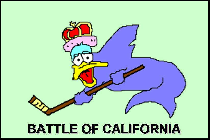
Is it time for the Ducks to get a logo?
I must admit, I was pretty inspired by Pfizer's mother-of-all-Canucks-logos (happy birthday, Alanah!); it really got me to thinking--shouldn't the Ducks get back to the logo game? If you recall, last summer the Ducks introduced their new look uniforms, featuring a webbed-foot text which was at least successful in reminding absolutely nobody of Disney, but still it lacked a true logo. Instead of a picture of an actual duck, we instead were treated with forensic evidence that suggests that duck-like creatures may have once inhabited the earth.
Anyway, now that the team has divorced itself from the Disney movie, I can't really say what association the team or the city of Anaheim has with actual ducks. But with the right logo, maybe we could re-associate the team name with the actual identity of the team--we could stop pretending that “Duck” refers to some animal, and instead acknowledge that it better reflects an appropriate action to take when May, Bertuzzi, or Pronger is skating up to you.
So here's my proposed Anaheim logo for '07-'08. Enjoy!:

I've been spending a lot of time this summer commenting at Interchangeable Parts--I'm not sure how best to describe it, except the commenters there are hilarious; it's really a blog to hang out at. Pookie and Schnookie have been diligently running a summer series "118 reasons why we love hockey", where they celebrate different aspects of today's NHL (or hockey in general). Anyway, I got to write one as a reader submission, so if you're interested you can see one reason why I love hockey, though if you cruise the archives you'll see that they've got a lot of better-written posts than mine.
![]()


10 comments:
I've always thought you guys should have gone with the logo from the first Mighty Ducks movie, where it was the duck playing hockey. Of course, I always think logos should be of animals playing hockey, so don't listen to me.
Earl, that graphic is hilarious!
Thanks very much for the birthday wishes, Earl. But geez, I wish you'd used a different image of Bertuzzi... that one gives a Canucks' fan nightmares even now. :)
That logo is exactly what I am afraid of...
Another reason to hate the Bertuzzi signing
But geez, I wish you'd used a different image of Bertuzzi... that one gives a Canucks' fan nightmares even now. :)
Hey, here in Anaheim he's just one of many felons. Who else can we get?
Mark Bell's going to jail? How much do you think Toronto wants for him? And does anyone have Marty McSorley's phone number?
And does anyone have Marty McSorley's phone number?
Heh, the Sharks (thankfully) replaced McSorley with Drew Remenda, so technically, you guys could fire Hayward and have Marty be the Ducks' color guy. He's pretty damn bad himself, but having heard Hayward on NBC, I can assure you it's an improvement.
I love Hayward on NBC!
(only because it means that somebody tolerable will be calling the Ducks game that night)
Nice work Earl. I'm sure you'll soon hold exclusive rights to logo design for the NHL.
I still like it better without the words. Excellent job. Hilarious.
Maybe the secondary logo patch on the sleeve could be a generic head outline with a target on it. :D
Post a Comment